01 - Portfolio Project
A comprehensive end-to-end product design for Soullylush - India's organic D2C health & wellness brand. As sole designer on the project, I built one design system across four platforms: the web storefront, the native mobile app, a Farmer Operations dashboard, and an in-progress BI dashboard for business managers. This case study documents the full design rationale: every decision, every tradeoff, every iteration.
One design system, three very different platforms
02 - Overview
Soullylush is a farm-to-home organic brand selling protein shakes, diapers, gummy vitamins, snacks, and skin care - certified by NPOP, FSSAI, ECOCERT, and Earth Seer.
The design challenge: make organic grocery feel as intuitive and emotionally resonant as walking into a trusted neighbourhood store - while one design system flexes across four completely different interaction paradigms: impulse-driven D2C shopping, native mobile commerce, field-operations monitoring for farmers, and executive decision-making for business managers.
I designed and built all four platforms solo - same colour system, same typography roles, same component logic - adapted to radically different users and stakes each time.
Design Mandate
"Organic grocery shoppers are high-trust, low-impulse buyers. Every design decision must reduce anxiety and build confidence - not just look good."
03 - Problem Statement
India's organic grocery market is growing rapidly, but faces a persistent credibility problem. Customers are willing to pay a premium - but they drop off at two critical moments.
"Is this brand actually organic - or just marketing?" Users leave before they reach certifications buried at the bottom of the page.
"Can I find what I need quickly and trust this checkout?" Ambiguous UX patterns in cart and checkout lose buyers at the final step.
04 - Target Users
I used these three audience profiles as design lenses to evaluate key user needs and interaction priorities. A senior designer doesn't design for an average user - they design for the spectrum.
05 - Web Platform
The web experience isn't just responsive mobile - it's purpose-built for discovery, brand storytelling, and SEO. Every section has a conversion role.
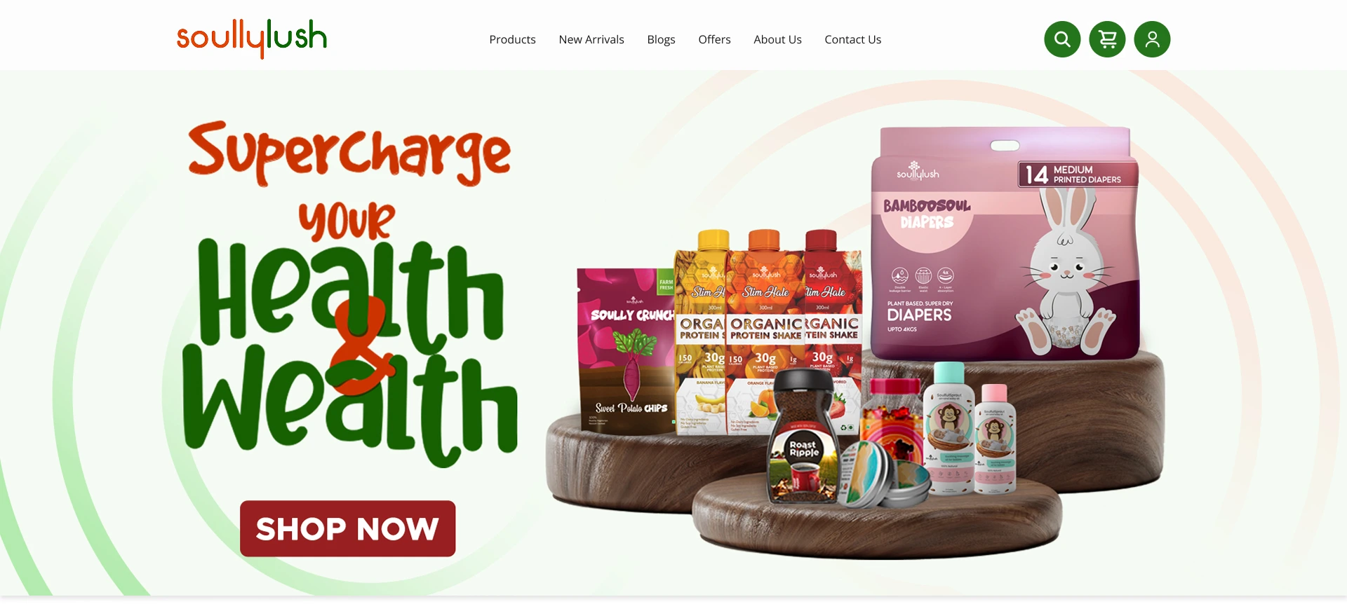
The hero combines personal wellbeing and financial wisdom. Mixed-weight display type creates visual impact. The wooden base in the product imagery communicates naturalism without being sterile.
Four world-class certifications, positioned right after the hero section rather than above the fold. This was a deliberate flow decision: let the value proposition and product range land first, then earn trust with credentials once the visitor is already engaged - not before they know what the brand is.
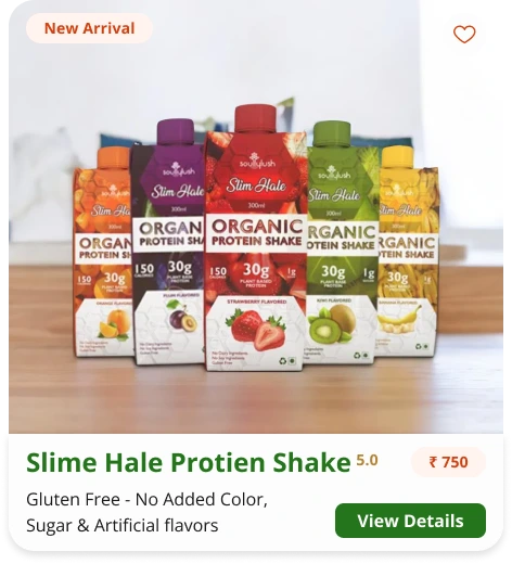
Labelling products 'Featured', 'Best Seller', and 'New Arrival' creates editorial authority without overwhelming the user with rating numbers - a subtle but effective trust pattern.
Neither change ships until it's validated against the analytics report.
06 - Mobile Application
The app assumes higher baseline intent. The user has already downloaded it - they want to find, decide, and buy. Every interaction should feel purposeful and quick.
Read this section like a hiring manager would
Nine screens, one continuous decision: reduce anxiety, protect momentum, get to "Add to Cart" without a wasted tap. Skim the frame, read the one line under it, move on - the full reasoning for every tradeoff is in the cards below the flow.
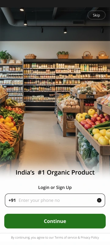
Skip-to-browse first. Trust is earned before data is asked for - full catalogue browsing works with zero account, signup deferred to actual purchase intent.
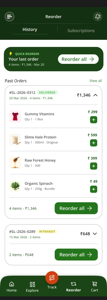
Location context up top, Reorder promoted into primary nav. Retention behaviour built into the base layout, not bolted on later.
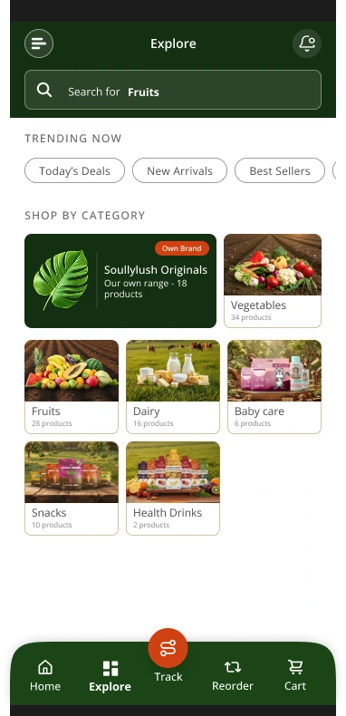
Category-first discovery for a low-impulse, high-trust shopper - filters lead with certification and source, not just price or rating.
One-tap repeat of last month's full list. Removes the single biggest friction point for a grocery-replenishment user: rebuilding a 35-item cart from memory.
Variant, subscription toggle, and trust badges on one scroll. For organic health products the proof has to sit next to the buy button, not link away.
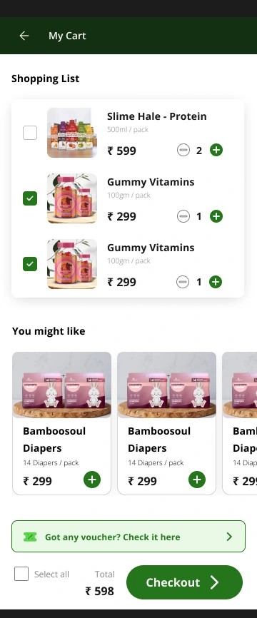
Checkbox model mapped to a physical shopping-list habit, not the standard "everything in cart gets bought" convention. Tradeoff detailed below.
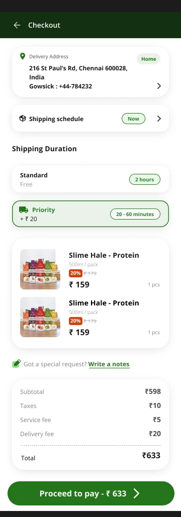
Address, shipping tier, and full cost breakdown compressed onto a single page. Total cost transparency before payment - no fee surprises at the last step.
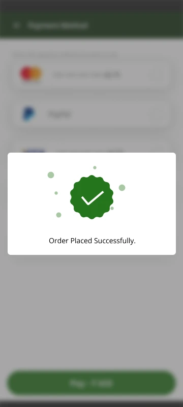
Confirmation closes the trust loop, not just the transaction - delivery window and support access surface immediately, while confidence is highest.
Reorder and Track sit at the navigation level instead of inside an
account menu. The Reorder tab exists specifically so a user can
repurchase last month's full grocery list - 35 items, unchanged -
in one tap, rather than rebuilding it manually.
Based on feedback and observations from users familiar with similar grocery applications, I prioritised order tracking as a primary navigation task.
User request: on the existing app they were used to, it was buried
inside Profile, and they wanted it surfaced.
The cart uses a checkbox model, letting items be ticked on or off before checkout. This maps directly to how the target user already shops - ticking off items on a physical grocery list - rather than following the standard "everything in cart gets bought" e-commerce pattern.
The login screen leads with a Skip option, not a form. A first-time visitor can explore the full catalogue - categories, PDPs, prices, certifications - with zero account. Account creation is deferred to the moment intent is highest: the first "Add to Cart."
07 - Farmer Operations Dashboard
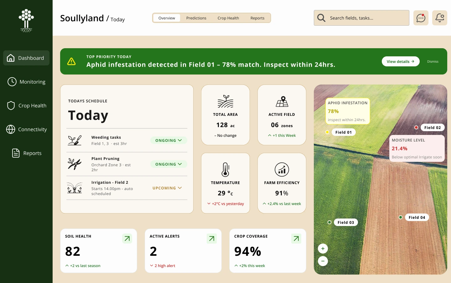
Soullyland is a desktop dashboard for the farmers and field teams supplying Soullylush. Instead of driving an impulse purchase in eight seconds, it needs to hold a field manager's attention for an entire shift - surfacing risk, not merchandise.
Built as living teaching material for my students at Image Creative Education: two core screens are fully designed - Overview and Predictions - with Crop Health, Reports, and further flows planned as the next teaching modules, so learners can watch the system extend over time rather than see it finished.
Where the D2C home screen leads with imagery, this leads with numbers. Total area, crop health score, moisture, farm efficiency, active alerts, and soil health sit above the fold as the first thing a farm manager sees each morning - matching how they already think about the farm.
Overview answers "how is the farm right now." Predictions answers "what should I do next." Splitting these into separate tabs - rather than one overloaded screen - keeps each screen honest about the question it's answering.
08 - BI Manager Dashboard
Where Soullyland tells a field manager about crops, the BI dashboard will tell a business manager about the company: the same system, extended one more time, for an audience that thinks in revenue and retention rather than moisture and yield.
Design Intent
Reusing the Soullyland Overview grid - stat cards up top, a primary visual centrepiece, supporting trend charts below - means a manager moving between the farmer dashboard and the business dashboard doesn't have to relearn a layout, only a vocabulary. KPIs replace crop metrics; pie, line, and bar charts replace the field map. Same skeleton, same design tokens, different story.
The BI dashboard is not merged into Soullyland, even though they'll share a design system. Not every farmer is equipped with the education or data literacy to read graphs and charts fluently - the same visual language that helps a business manager scan revenue trends in seconds would add friction, not clarity, for a field user. Two dashboards, one system, deliberately different depths of data visualisation for two different levels of data fluency.
09 - Design System
Colour and typography aren't decoration. They create the emotional context within which a user decides whether to trust a brand. Every green communicates health. Every warm orange signals urgency and harvest energy.
10 - Iteration Roadmap
This isn't a list of what went wrong. It's a prioritised brief for what comes next. Every product designer worth hiring knows that v1 is the start of a conversation, not the end.
11 - Success Metrics
12 - Designer Reflection
Designing Soullylush reinforced a core belief: a beautiful e-commerce interface that doesn't guide the user to 'Add to Cart' is a failed design - regardless of how polished it looks.
This project deepened my appreciation for category-specific design constraints. Organic grocery is not fashion e-commerce or SaaS. The purchase psychology is slower, the trust barriers are higher, and the emotional payoff is long-term health, not instant gratification. Every section had to work harder to answer one implicit question: "Can I trust this brand with my family's health?"
The dual-platform challenge was equally instructive. The web homepage needed to tell a complete brand story. The mobile app assumed higher intent - the user wants to complete a task, not read a mission statement. Designing for these two mindsets simultaneously, while maintaining visual and behavioural coherence, required continuous calibration between storytelling and efficiency.
Jayaprakash · UI/UX Designer · Visual Designer
3 years of product design across D2C, SaaS, branding, and editorial. Based in Chennai. Available with 90-day notice.
© 2025 Jayaprakash · Product | UX Designer · Case study