Solo adventure seeker
I want to discover adventurous places like trekking and surfing spots, so I can plan an exciting trip without existing trip experiences.
A theme-based, mobile-first redesign built around real traveler stories, transparent booking, and the state's own cultural identity - not a government-notice-board.
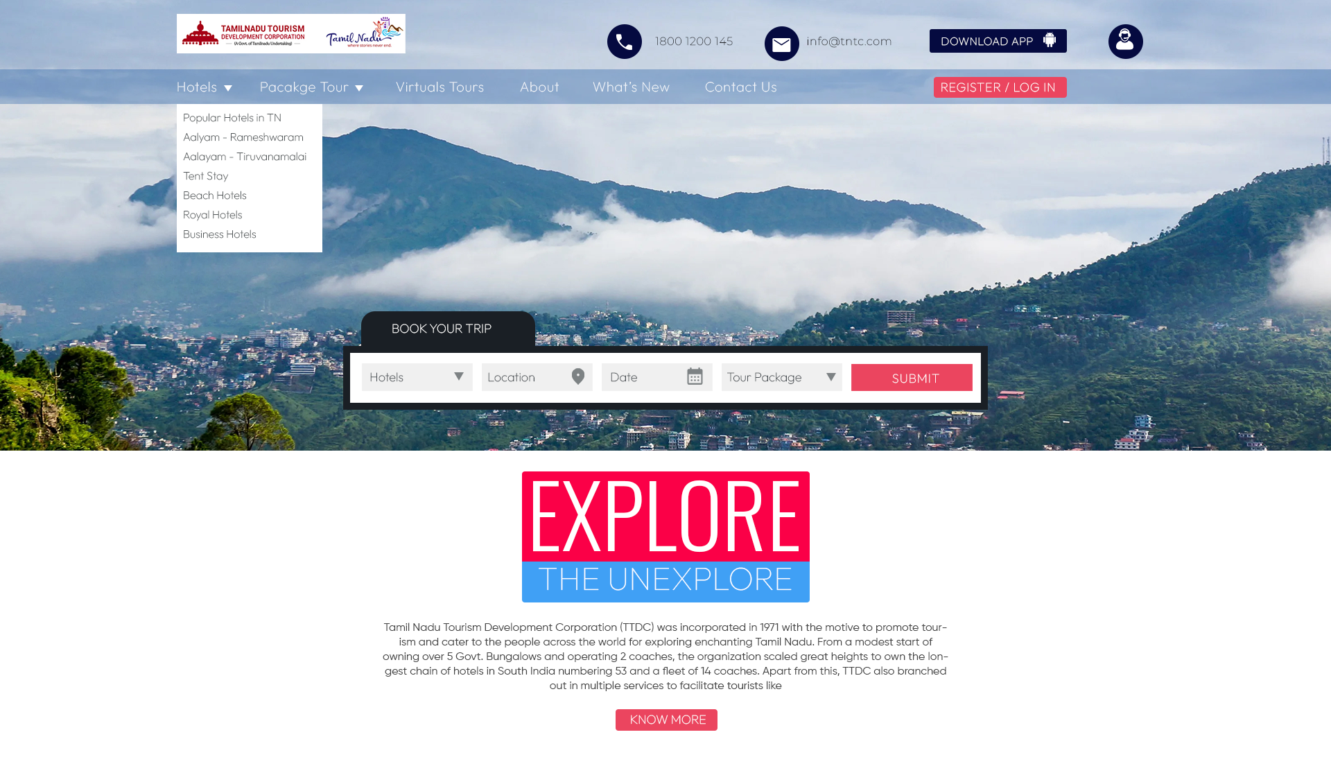
"This introduces a theme-based layout with intuitive navigation, real traveler stories, and booking features. It focuses on accessibility, clarity."

User research pointed to real business stakes - a redesign only earns its budget if it moves these too.
Verified listings keep travelers booking through the government site instead of leaking to OTAs like MakeMyTrip.
↑ booking conversionInterviewees described the old site as unusable on mobile - a clearer structure keeps them exploring instead of leaving.
↓ bounce rateTheme-based discovery surfaces lesser-known temples, hills, and coastal towns - not just the destinations everyone already knows.
↑ destination reachTravelers said they don't trust official sites the way they trust private platforms - real stories and photos close that gap.
↑ platform credibilityFour legs of the same journey - from open-ended discovery to a shipped UI, each stop narrowing the problem down.
Three competitors were benchmarked. The pattern: shallow theming, weak booking trust, and almost no traveler voice - which shaped where this redesign chose to lead.
| Feature | Kerala Tourism | Incredible India | MakeMyTrip | TN Tourism (redesign) |
|---|---|---|---|---|
| Theme-based exploration | Limited | Limited | Good | Strong |
| Booking support | None | None | Strong | Strong |
| Traveler stories | Limited | None | None | Strong |
| Virtual tours | Good | Good | None | Strong |
| Cultural personalization | Moderate | High | None | High |
| Accessibility | Good | Good | High | High |
Eight interviews surfaced the same friction again and again - with competitor sites and with wishes for what an ideal platform could feel like.
The current site feels like a notice board, not a travel guide.
I plan trips around themes - like temples or hill stations - but I had to Google everything separately.
It's hard to know what's trustworthy online. Government sites should feel more reliable.
The homepage should tell me what's new or seasonal.
Three personas structured the platform around the tour organizer and the traveler - not the department publishing the content.

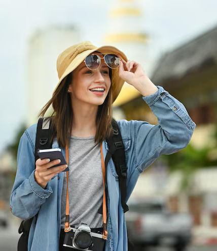
Twelve stories were written to pin down what situation, and for what purpose, the platform would be used.
I want to discover adventurous places like trekking and surfing spots, so I can plan an exciting trip without existing trip experiences.
I want to explore destinations that are safe and family-friendly, so I can plan a trip without worrying about logistics.
I want to find pilgrimage destinations and cultural events, so I can plan my trip during important festivals.
I want to read real traveler stories and see actual photos, so I can feel confident and inspired before booking.
Each hypothesis links a design decision to a problem found in research - so every screen ships with a reason attached.
we organize website content around user intent and travel themes
users will find relevant destinations, activities, and accommodations faster
they aren't currently able to filter or explore based on specific interests like adventure, honeymoon, or religious tourism on the site
we let the site offer booking or inquiries through verified listings
travelers will avoid third-party uncertainty and prefer using the government site
trust in authenticity and safety is a major concern
we show real traveler stories and photos
users will feel more confident exploring lesser-known destinations
social proof builds trust and inspires exploration
we introduce a clear, mobile-friendly navigation structure
engagement and return visits will increase
the current bounce rate suggests users leave due to poor usability
The homepage carries every research decision through - theme-based browsing, a persistent booking widget, real traveler stories, and a trust strip built to compete with private platforms.
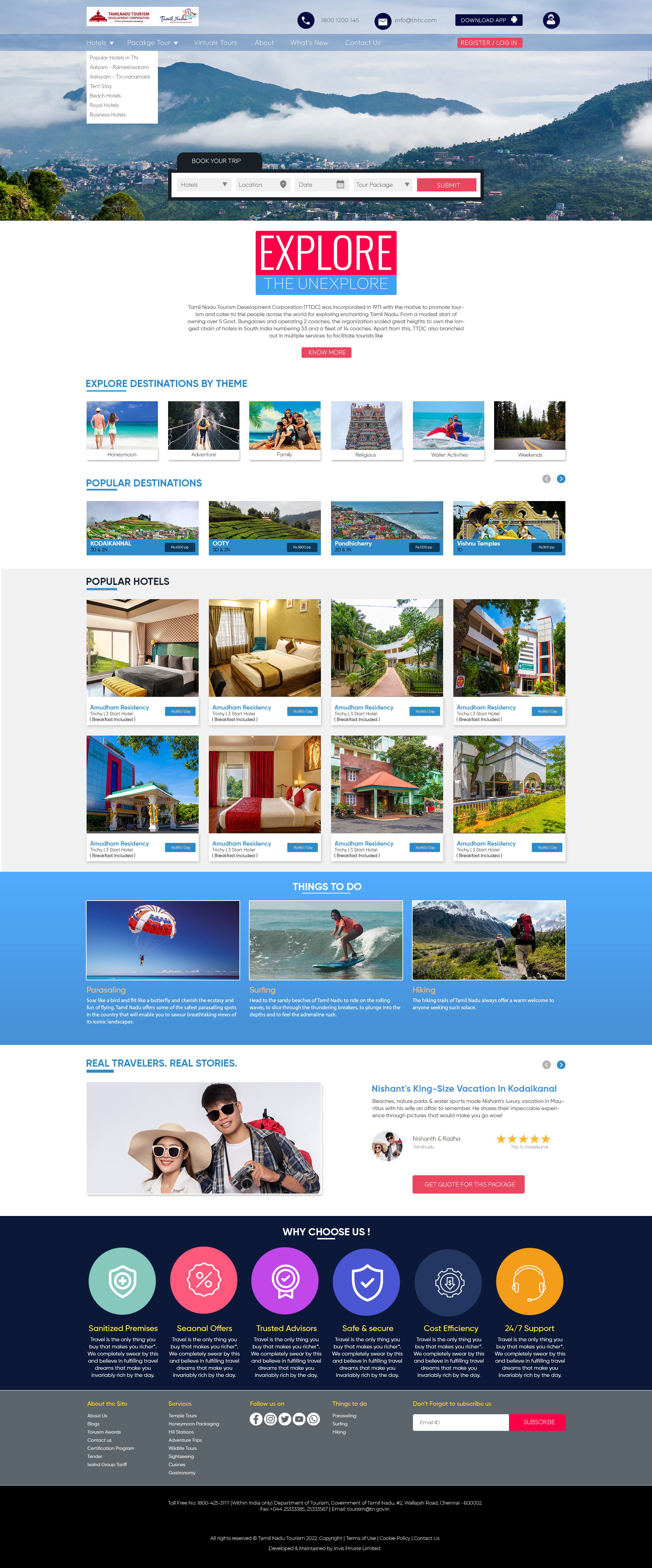
Hotel, location, date, and package fields sit directly in the hero - no digging before you can start planning.
→ Goal 01 · Booking conversionHoneymoon, Adventure, Family, Religious, Water Activities, and Weekends replace one long undifferentiated destination list.
→ Hypothesis 01 · Intent-based navNamed travelers, trip photos, and star ratings sit right on the homepage - not buried in a blog.
→ Hypothesis 03 · Social proofSanitized premises, trusted advisors, safe & secure, 24/7 support - addressing the credibility gap travelers named directly.
→ Goal 04 · Platform credibilityFour different entry points - hotels, packages, themes, virtual tours - all funnel into one consistent path toward booking, with trust touchpoints placed exactly where research showed hesitation.
Low-fidelity structure locked the hierarchy in before a single color or photo was chosen.
A geometric type pairing and a palette drawn straight from the hero image - sky blue, alert coral, and a brass note for the state's temple heritage.